Wallex Exchange · 2021–23
NFT Marketplace
Designed an NFT marketplace end to end, every state included, so development could build it without guessing.
8
item states designed, from live auction to sold
3
breakpoints: desktop, tablet and mobile
5
design versions in two months
00 / Summary
- Role
- Product designer
- When
- Oct–Dec 2021 (five design versions)
- Platform
- Web · desktop, tablet and mobile
- Method
- Flows, state mapping, high-fidelity prototypes
- Colour
- #5B21B6
- Problem
- An NFT sale has many moving parts (wallets, networks, auctions, royalties), and every one of them can fail or change mid-flow.
- What I did
- Led the end-to-end design across desktop, tablet and mobile, mapping every item state, wallet step and error, through five versions.
- Result
- It launched, partnered with a gallery and went to an exhibition in Dubai, before the NFT market turned and interest faded.
01Problem
The happy path is one screen. Everything else is the product.
A marketplace demo shows a picture, a price and a button. A real NFT sale has more going on. The visitor may not have a wallet. Their wallet may be on the wrong network. The item may be on auction or at a fixed price, live or not started, sold or never for sale. Every purchase also pays a royalty to the creator, and minting takes several blockchain transactions that can each stall.
If the design only covers the happy path, developers fill in the rest themselves, and each of those guesses is a place where users get lost or lose trust.
02Every state
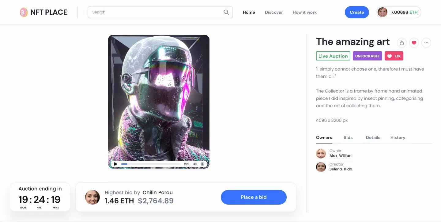
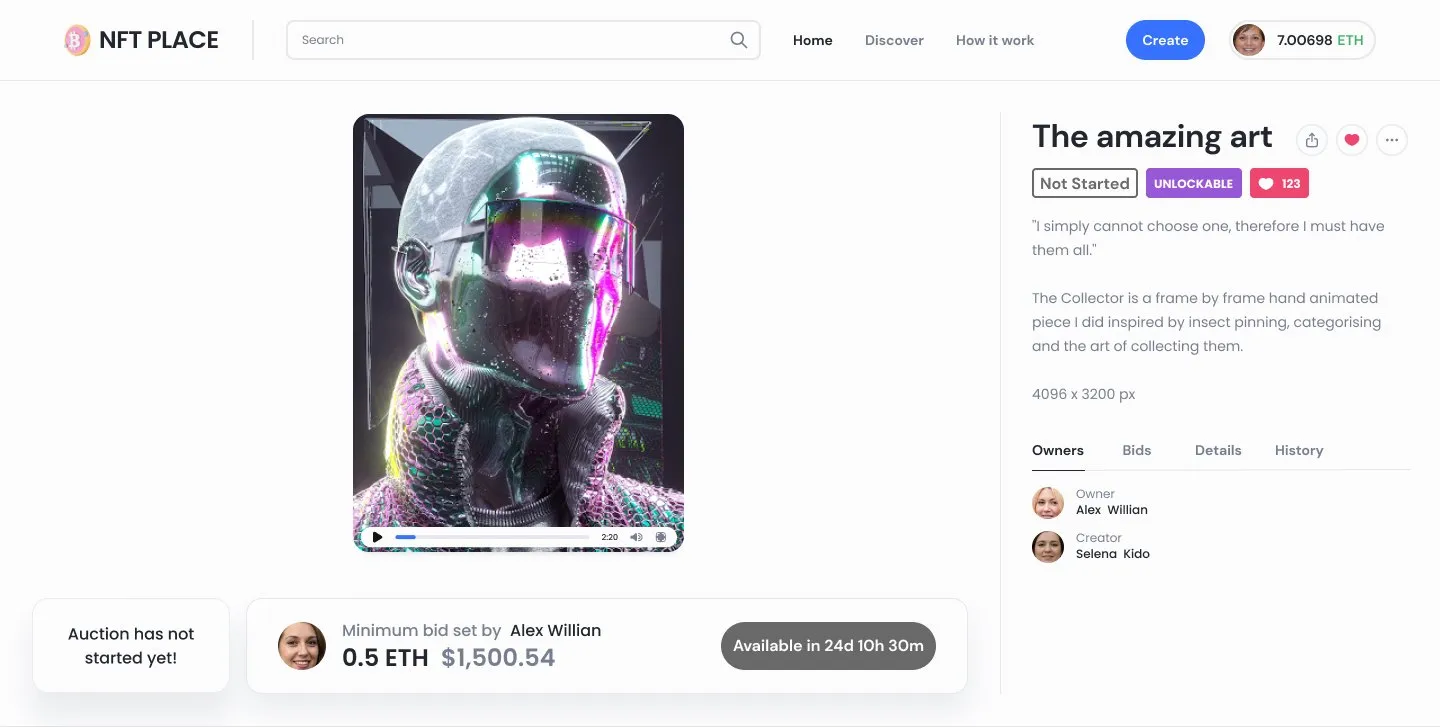
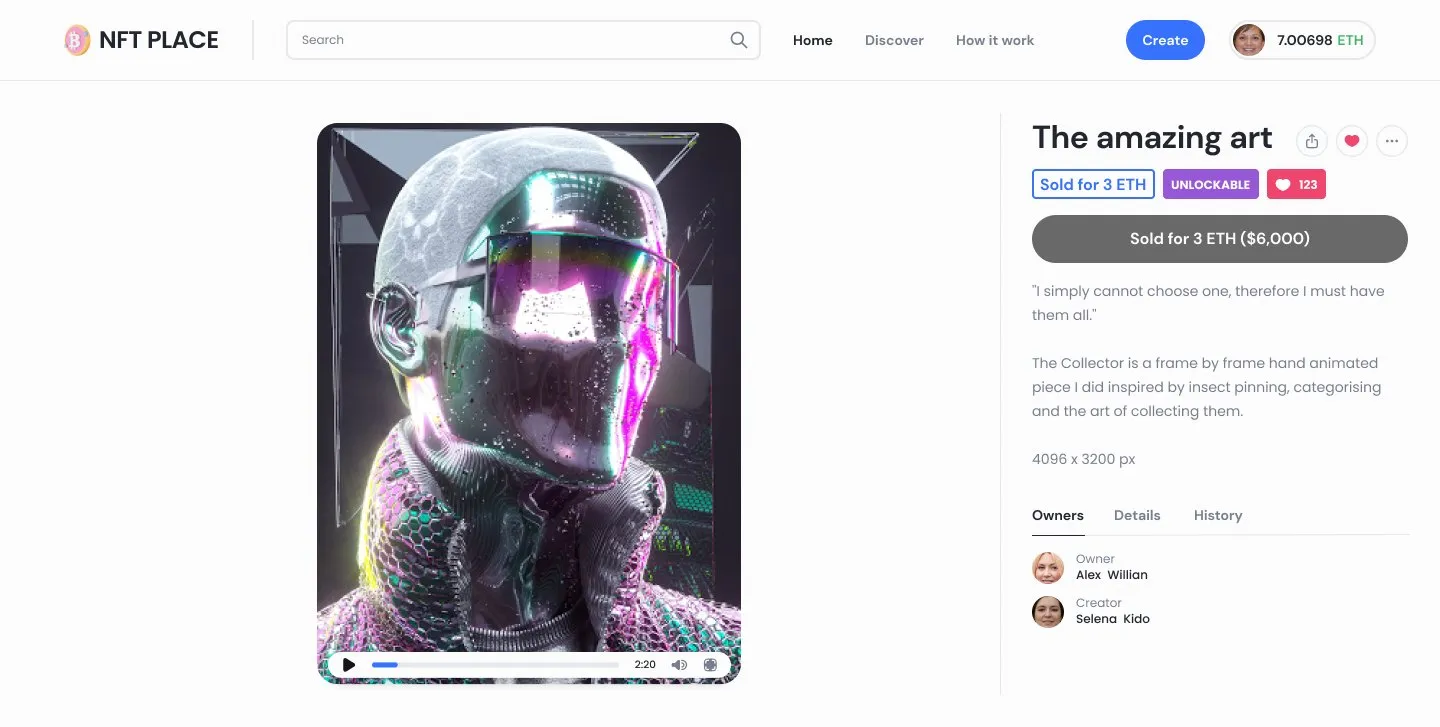
One item, eight states.
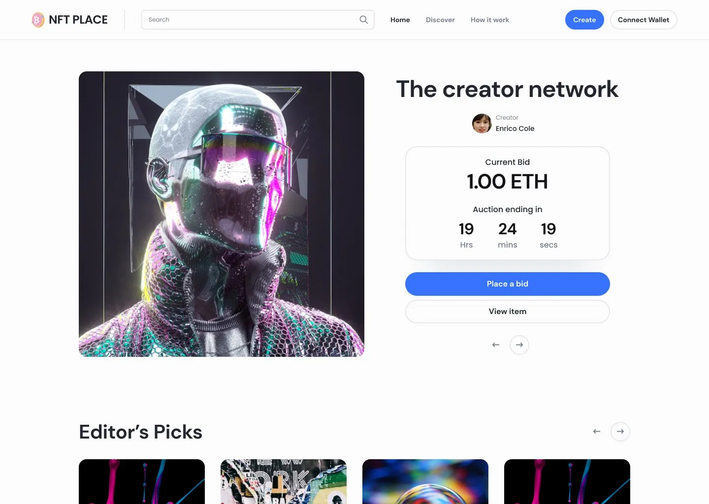
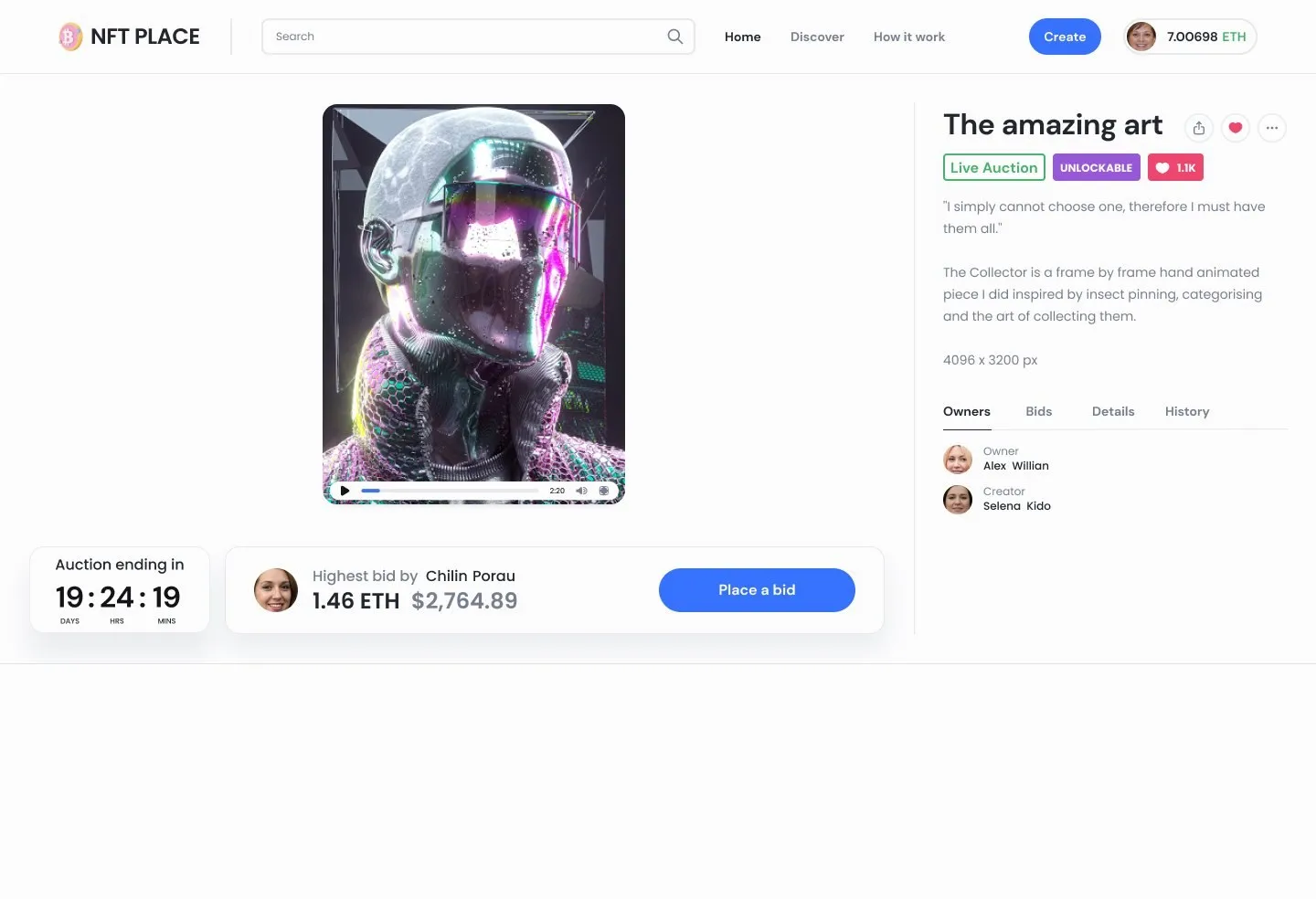
I mapped the item page as a set of states rather than a single layout: fixed price live, sold or not started; auction live, closed, closed with no bids, or not started; and not for sale. Each state keeps the same structure, with the artwork on the left and the facts on the right. Only the status badge and the action change, so a collector always knows where to look.
The owner gets their own view of the same page, with tools to change the price, accept a bid, remove the item from sale or burn it.
03Wallets
Say what’s happening in plain words.
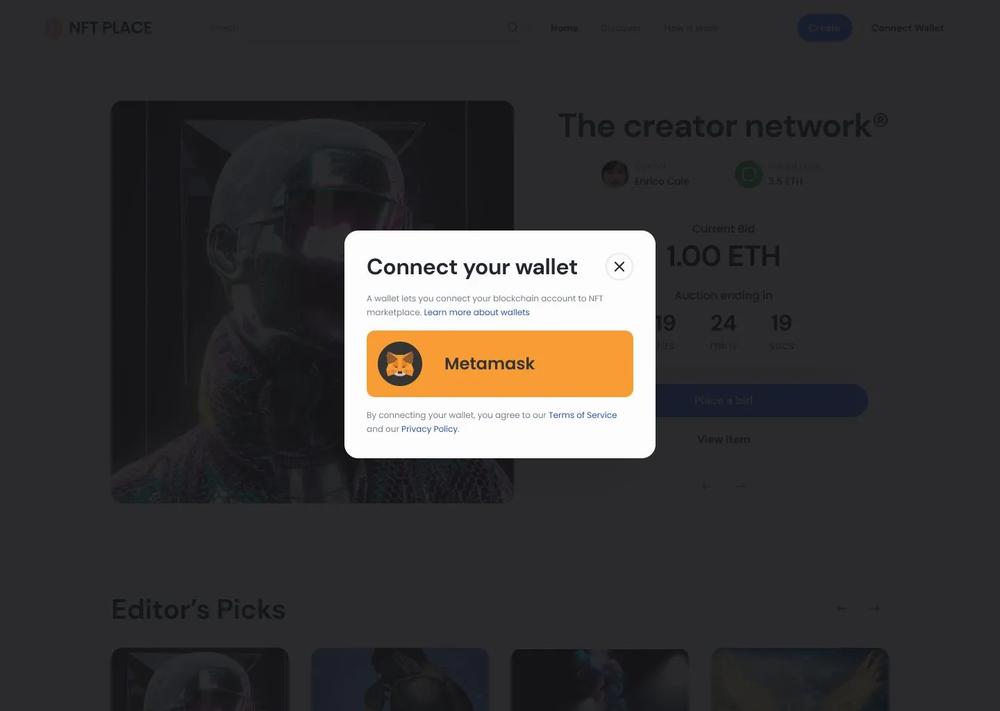
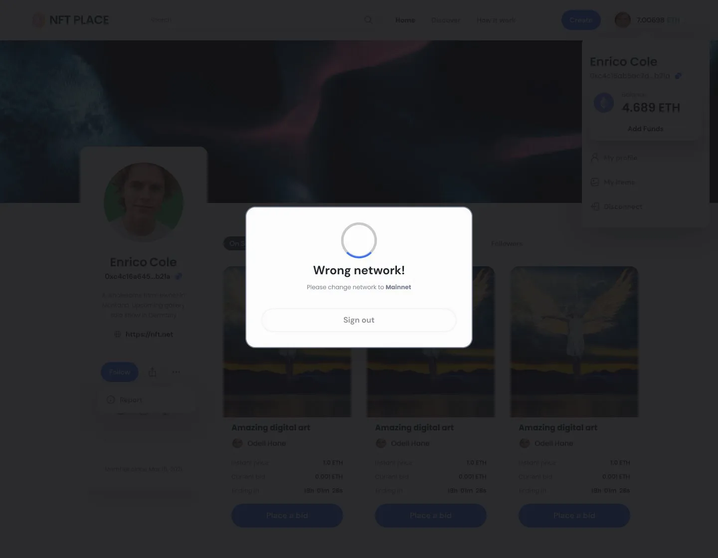
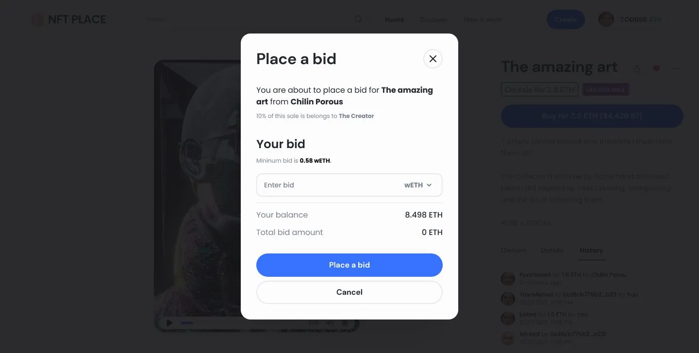
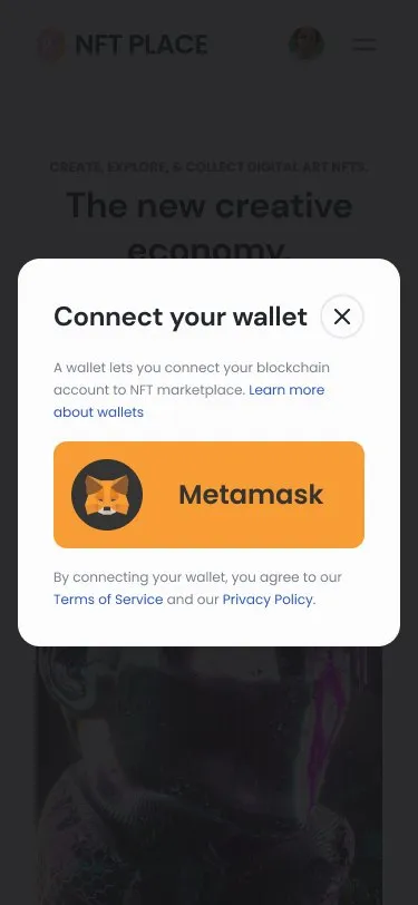
Crypto flows fail in ways ordinary checkouts don’t. So the edges got real screens, not error codes. Connecting a wallet explains what a wallet is before asking for one. A wallet on the wrong network gets a clear message and one way out. Before anyone bids, the bid window states the minimum, their balance and the total, and says up front that 10% of the sale goes to the creator.
04Creating
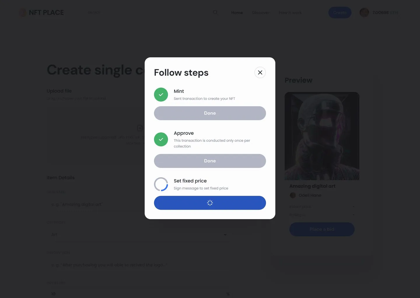
Three transactions, shown as a checklist.
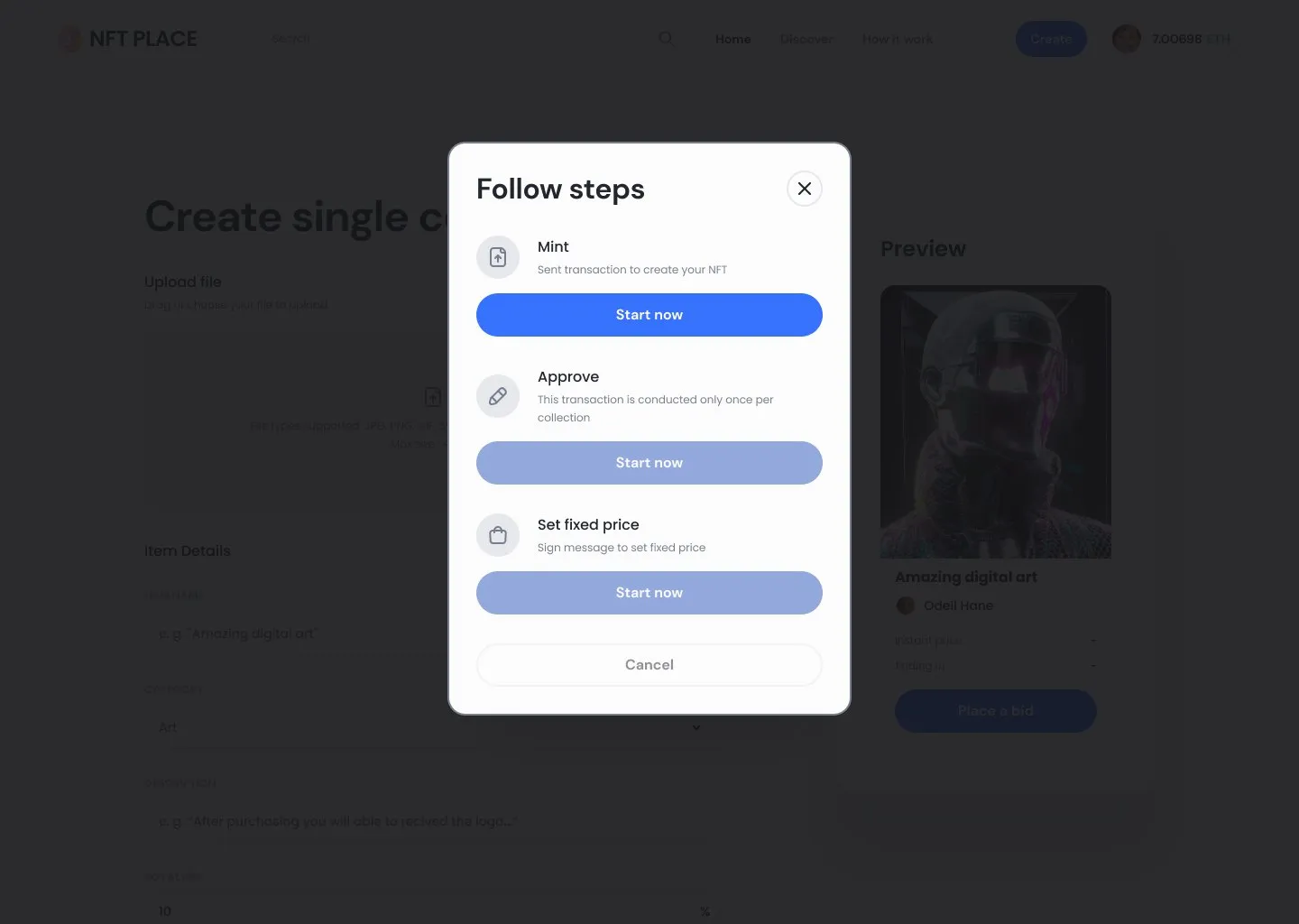
Putting an NFT on sale takes three separate blockchain actions: mint it, approve the collection, then sign the price. Each one opens the wallet and waits. Shown one after another with no context, they feel like the same request three times.
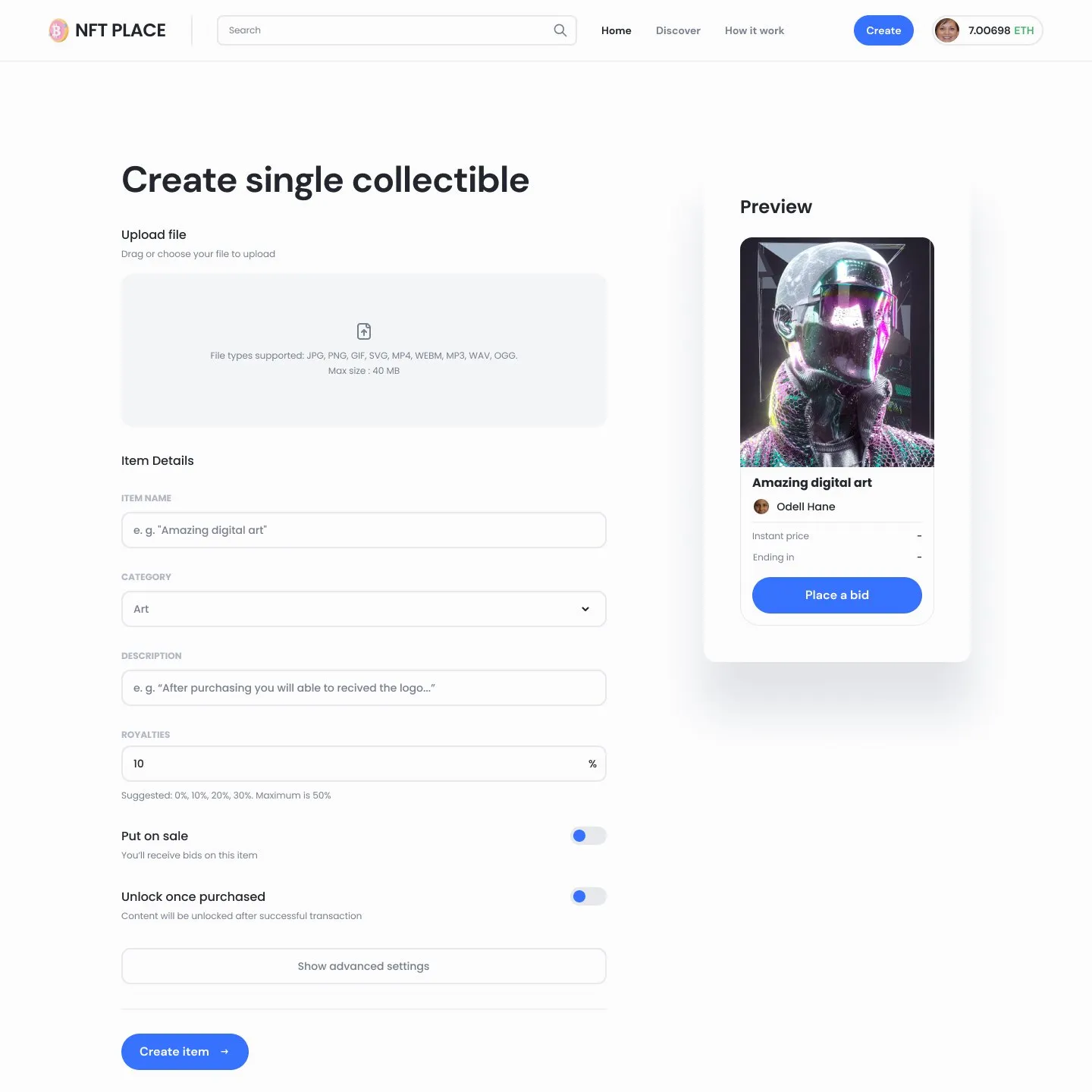
I turned them into a short checklist. Each step says what it does and why. Only the current step is active, finished steps tick off, and the creator can see how far they’ve got. While they fill in the form, a live preview shows the card exactly as collectors will see it.
05Every screen size
Desktop, tablet and mobile.
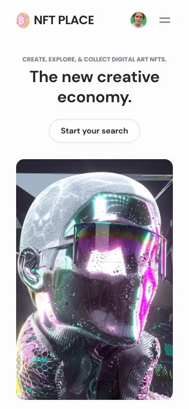
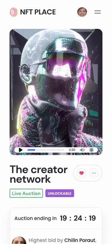
Every main page was designed at three sizes, 1440, 768 and 375 pixels wide. On a phone, the item page stacks: artwork, title and status, then the auction box with the countdown and the bid button together, so the decision is never split across the screen.
06Outcome
Built from the design, not from guesses.
Over five versions, from late October to Christmas 2021, the file grew from the core pages into a complete system. Version 1.5 added owner tools, sharing, image zoom, auction countdowns, custom properties and royalties in the details tab, plus loading, network and error screens.
The prototypes were matched to the technical specification, which got the build ready for development sooner. Because every state already had a screen, developers didn’t have to invent one.
The marketplace launched. It partnered with a gallery and took part in an exhibition in Dubai. Then the NFT market turned. Most collectors were sitting on losses, interest dried up across the industry, and so did activity here. A good product can’t outrun its market, and I don’t have usage numbers worth quoting.
07Revisited, 2026
Five years later, one decision panel.
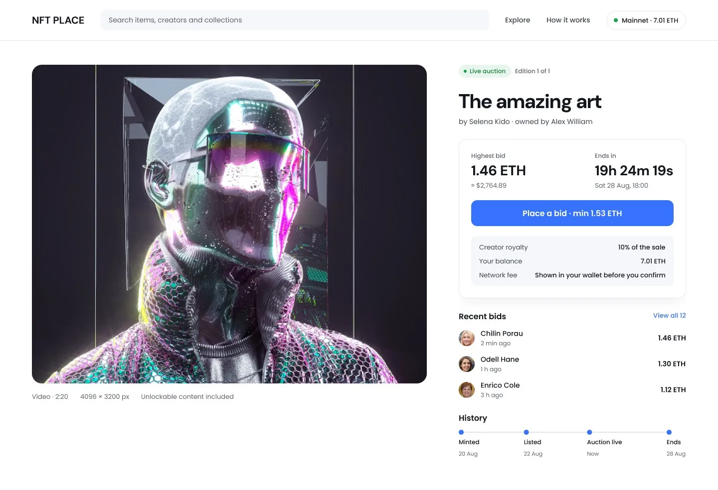
The 2021 item page works, but the decision is spread out. The price and countdown sit at the bottom left, the action is far from the facts it depends on, and the royalty only appears once the bid window opens. I redesigned the live-auction page in 2026 to fix that. This is a revisit, not what shipped.
- Everything needed to decide sits in one card: highest bid in ETH and dollars, time left with the actual end date, and the minimum bid written on the button.
- The costs come before the click: the creator royalty, the visitor’s balance and where the network fee will appear are on the page, not hidden in a window.
- Bids are visible without opening a tab: the latest three, with a link to all of them.
- The item’s history reads as a timeline: minted, listed, auction live, ends.
- Text contrast is stronger: the original’s grey descriptions were hard to read.
08Reflection
What I took from it.
In crypto, the edge cases are the product. A wrong network or a stalled transaction isn’t rare; it’s a normal Tuesday. Designing those states first made everything else simpler, and showing the royalty before the bid taught me that trust comes from what you say before money moves, not after.