Wallex Exchange · 2021–23
Bitoment
Turned crypto and forex investing into three fixed plans with risk you can read at a glance, then rebuilt two flows after testing.
3
fixed plans instead of a trading screen
1
decision left to the user: how much risk
2
flows rebuilt after in-person testing
00 / Summary
- Role
- Product designer
- When
- 2021–23
- Platform
- Mobile app
- Method
- In-person usability testing
- Colour
- #3D77E9
- Problem
- People with small savings wanted to invest, but every app was built for traders and asked for decisions they couldn't make.
- What I did
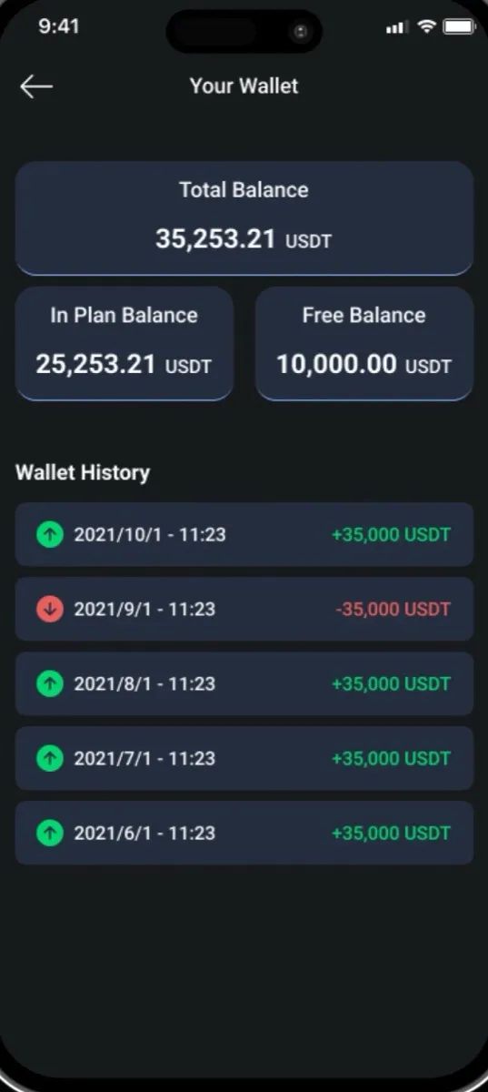
- Replaced trading with three fixed plans, showed risk as a Jenga tower, and made the wallet always say where the money is.
- Result
- Two flows rebuilt after in-person testing. Tested, not launched, and in hindsight one plan looked safer than crypto can be.
01Problem
Every investing app assumed you already knew how to invest.
Open almost any crypto or forex app and the first screen is a candlestick chart, an order book and a leverage slider. That works for traders. It shuts out everyone else.
Bitoment’s users were everyone else: people with a few hundred dollars in savings who wanted that money to grow, or at least not shrink. For them, losing even 100 dollars is personal. They faced three barriers: no market vocabulary, no reason to trust a new app with their savings, and a sense that these products weren’t meant for amounts this small.
02The bet
Beginners can’t choose what to buy. They can choose how much risk.
Two familiar models were on the table. A trading app gives full control and assumes expertise. A robo-advisor needs no expertise but hides every choice, so people can’t tell what they signed up for.
We proposed a third shape: fixed plans. The user makes one decision, how much risk, and the plan handles the rest for 3, 6 or 12 months. That one choice is the one a beginner can actually reason about, and it stays visible: they always know which risk they picked and until when.
It had a real cost. Experienced investors, who also took part in testing, lose the ability to build their own mix. We accepted that, because the product existed for the people current apps ignore.
If people no longer see the market, the product has to show them what the market could do to their money.
03Comparison
Every plan answers the same three questions.
How much can I lose? How much can I make? When do I get it back?
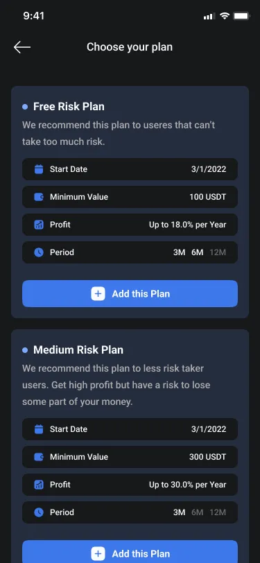
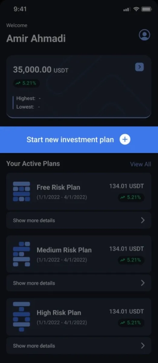
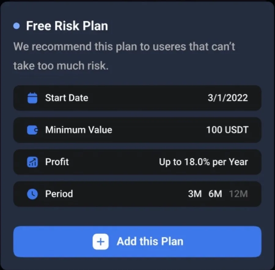
Every plan card shows the same four facts in the same order: start date, minimum amount, expected yearly profit and period. Three plans compared on identical terms, instead of a catalogue of products.
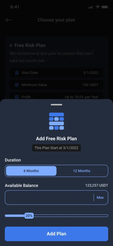
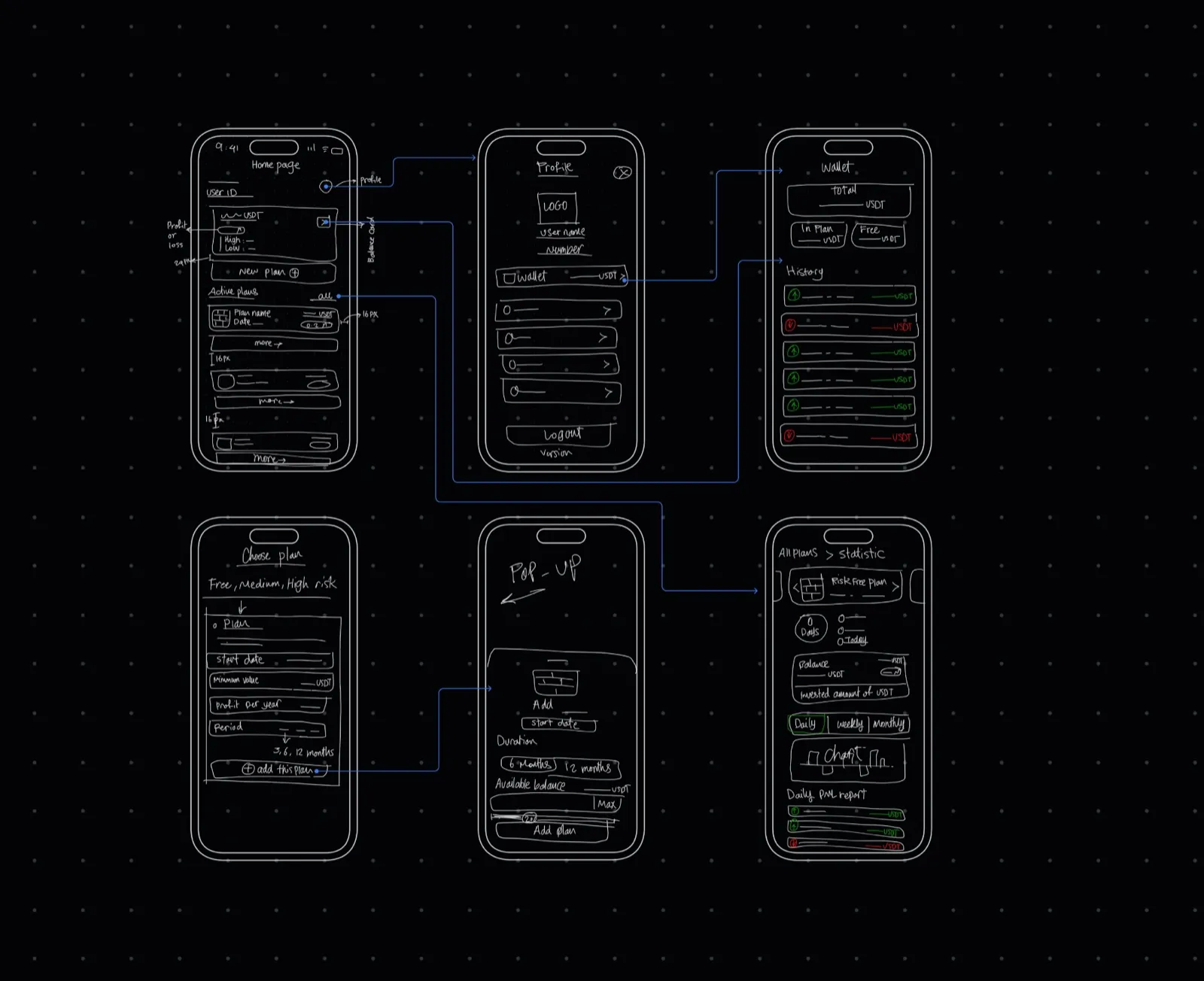
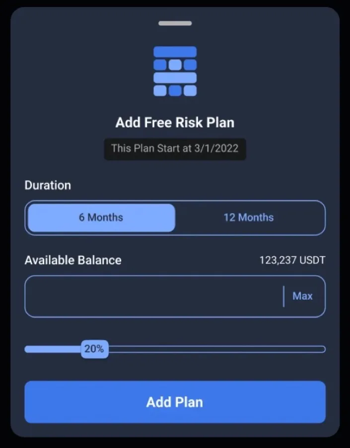
Adding money works as a share of your balance, not a typed amount. “20% of what I have” is easier and safer to reason about than “how much should I put in?” Typing an amount and Max stay available for people who want precision.
04Risk
Risk needed a picture, not a percentage.
A risk score or a percentage still needs finance vocabulary. We wanted something anyone reads the same way, instantly.
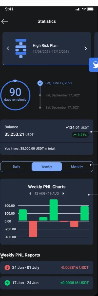
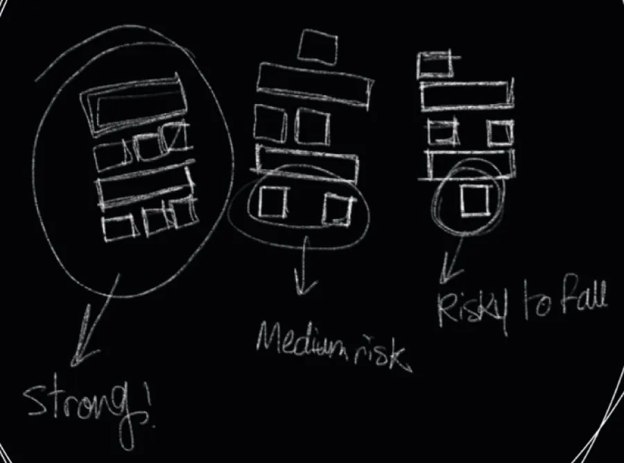
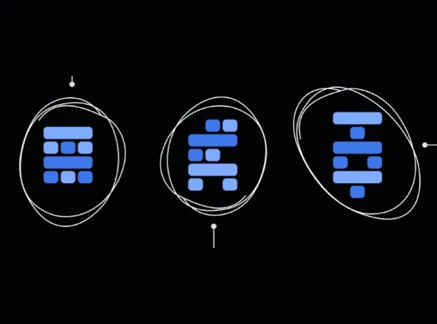
Everyone knows a Jenga tower. A full tower stands. A tower with gaps wobbles. A tower on a few blocks is about to fall. So each plan got a tower: strong, medium, risky to fall. The tower follows the plan everywhere, on the plan list, on home and on statistics. A plan never appears without its risk.
05Testing
Some people feared the app more than the market.
We tested the core tasks in person with novice and experienced investors: create an account, start a plan, check how it’s doing. Two things surprised us.
“Micro-investment” meant nothing to them
The idea that defined the product had to be explained inside the product. We simplified the investment flow and added short explanations and visuals at the moments people hesitated.
Trust came before returns
Several participants asked whether their money was safe before asking how the market might move. The phone-and-code sign-up was the fastest way in, and that speed read as flimsy for an app holding savings. We added biometric login, password protection and plain information on how funds are held.
For money, a little visible security is a feature, not friction.
06Outcome
The tower said “safe”. The market can’t.
Bitoment was tested but not launched, so there are no live numbers. Looking back, there’s a flaw I’d fix first.
Three plans for three kinds of investor, from lowest to highest risk, was the right structure. The problem was one name. The lowest-risk plan was called Risk-Free. It showed a full, untouched tower and “up to 18% a year”, and it invested in crypto and forex. Nothing in those markets is risk-free. Together, the name, the full tower and the profit ceiling told a beginner they couldn’t lose. A metaphor built to make risk honest made that one promise louder.
What I’d change:
- Rename it Low Risk. No tower should look untouchable.
- Show a range, not a ceiling. The possible loss sits next to the possible gain.
- Confirm understanding before money moves. One plain sentence the user agrees to.
If it launched, I’d watch whether it did its job: first plan within 7 days, whether the chosen plan matches the risk people say they’re comfortable with, and early withdrawals in the first month.
07Revisited, 2026
The same three plans, told honestly.
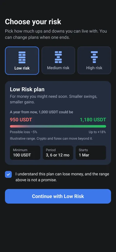
In 2026 I redesigned the plan screen around the three changes above. It’s a revisit, not what shipped.
- Low Risk, not Risk-Free. All three towers now have gaps, because none of the plans is untouchable.
- A range, not a ceiling. Instead of “up to 18% a year”, the plan shows what 1,000 USDT could become, from a possible loss to the best case, and labels the range as illustrative.
- One sentence to agree to before money moves. Continue stays tied to “I understand this plan can lose money”.
- One plan at a time. The three-card list becomes a risk picker with a single plan underneath, so the comparison happens in one place.
08Reflection
What I took from it.
For beginners, the interface is the explanation: taking the market off the screen didn’t remove the need to understand it. Trust is the first feature: people weigh the app before they weigh the plan. And a metaphor carries a promise, so whatever a design makes easy to believe has to be true.